Hola!
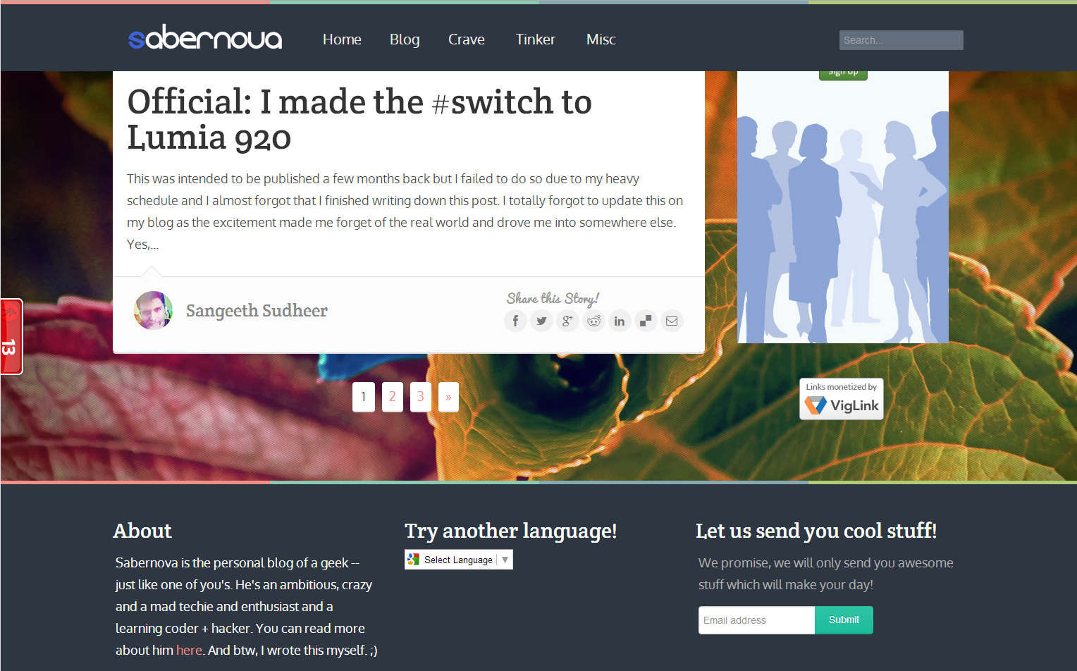
Well, you saw it! There's no need for further words. Yet again, as custom calls, this is an official post declaring the change in the template design of Sabernova. And you all are looking at it right now. Now, there are some questions to which I should answer right now and I will go through them one by one.
1. Why a quick change?
Well, tastes change. I am always going through new templates out there that's fresh and most importantly, responsive. Yes, I'm still a mediocre in web designing and knowing the web fundamentals in their advanced form but I'm getting hang of it. Plus, why responsive. Well, responsive templates are good for any start up or a passer blog since it can adapt quickly to any environment. Since today, most people prefer browsing across mobile devices (hard to believe), it is necessary to implement a system that would be friendly with such devices. Responsive templates automatically adjusts itself to fit any type of environment and can change accordingly to retain the original experience that you get from a big screen.
But the previous template ( Sensational ) was responsive. So, why did I ditch it? Yes, it was a nice template and I loved it for its simplicity and for taking me to the world of sliders again. But I learned that it was not perfectly responsive and some artifacts that I added later weren't fitting the template pretty well. In short, it almost ruined the 'Responsive' aspect of the template. Besides, loading times were much larger and this would affect a heavy part of my traffic.
I wouldn't thumbs down the old template as its still one of my favourite ones. But as time demands, I had to change. The new template, called Keilir is much more responsive and simple enough. Moreover, it had some cool effects that added to its simplicity and elegant nature. This forced me for a change and yes, now the site is nearly fully responsive.
2. How will the changes affect the Reader?
This is an important question and this is a very important aspect I always consider while designing and choosing new templates. Its always the user I put it in the first place. Its a probability that I can design amazingly beautiful blog by using powerful templates with various artifacts but I always want to make my blog readable to the average person. He/she should be able to qucikly read through the topics, view the visuals and be able to give proper feedbacks.
Keilir was the perfect choice in this case. Its much simpler and has a better navigation bar with the most important items. There isn't much complexity when it comes to browsing. Moreover, the width has increased significantly to provide more space for text and contents and to limit scrolling.
The next part was speed. This is another demanding aspect for every website. People don't like sites that take up time to load even if it contains good articles. They will get bored and irritated. With the new look, you won't need to wait for a long time as there are lesser artifacts and simpler design and powerful caching techniques and performance boost thanks to Cloudflare.
I'm sure that the user experience would be satisfactory.
3. What's next?
I'm not sure. I'm hoping to keep sticking with this template till the fall of this year till I get a much better responsive and neat template. However, I won't be leaving the blogger platform too soon. Sure, I'm interested in Wordpress but since hosting requires money, I can't avail to spend that much for my blog here. But if I get significant revenues within the next couple of months, I will plan to leave for Wordpress to begin a new journey.
As always, its the same blog but just a different look! Keep surfing!
- Sangeeth


